
Simandiraki® Traditional foods
The 'Simandirakis' company is a family business of traditional Cretan sweets, which operates since the late 1980s. The symbol of the logo is inspired by the preparation method of the xerotigana, with its lines visualising the winding of a strip of dough in a circular direction. The edge of the circle results in the shape of wheat, symbolizing the basic ingredient of the Simandirakis products. The logo has been rotated by 45º to form the fist letter of the company name (σ).
© 2013
© 2013

Andriotis® Greek Olive Oil (Corporate Identity)
Andriotis S.A. is a family business that specialises in the trade and processing of olive oil, for the last 55 years. The logo was designed in order reflect the classic and timeless values of the brand name, while at the same time updating the communication image. The symbol of the logo presents an olive with its pit, in section∙ the typography chosen, with serifs and capital letters, expresses the validity and reliability that characterise the Andriotis business.
© 2013
© 2013

Omega® Night Club
For the logo of the ''Omega'' dance club, in Mykonos, emphasis was placed on the letter Ω, which was designed in order to remind of the needle of a record player, thus linking the name of the club to its main characteristic, dance music. On a different level, the letter 'Ω' evokes connotations of a full moon and a wave, which, in combination with the blue color of the logo, create a symbol inextricably linked to the topographical location of the '’Omega'' club, in little Venice, Mykonos.
© 2013

Lavranos® Butcher Shop
© 2013
© 2013

Oleagreca® Olive Oil Company (Corporate Identity)
The client here is an oil trading company. The name is based on the product and the country of its origin, in Latin. In the logo, the name is read as one word, but visually the two words are separated by the different weight of their fonts, in order for the two words to be clearly comprehended. The color refers directly to the olive tree, while the symbol is inspired by the classic millstone.
Although, with the development of technology, the harvest of the fruit and the production process of olive oil have become easier, the production method remains the same over the centuries. Thus, the use of this symbol in the logo adds authenticity and lasting value to the logo. For this logo, a serifed typeface that conveys classical values was chosen. The modern design of the lowercase enhances the friendly nature of the logo and refers to the accessible profile of a natural product.
© 2013
© 2013

Justvillas® Fine Residences
The inspiration for the logo symbol came from the pomegranate. According to tradition, the pomegranate connects a house with good fortune and new beginnings. The abstract outline of a house inside the pomegranate forms a lock that refers to new property while, at the same time, the top of the pomegranate creates a crown, visualizing the luxury that characterizes these particular villas. Finally, the use of classical capital characters enhances the prestige, credibility and trust, core values of the brand.
© 2013
© 2013

Les Anagnou® Photographers (Corporate Identity)
The motive behind the renaming Studio Paul photography was the inclusion of the owner’s wife in the business. The new name, ‘Les Anagnou’, is inspired by the French roots of photography and it aims to showcase the new image of the family business. The symbol of the logo is inspired by the vision span of the human eye (at an angle of 90◦) and by the classic camera tripod. The symbol’s thickness, which is equal to the logo’s typography, enhances the logotype homogeneity, whereas the capital letters and choice of black as the dominant color reinforce the esteem and professionalism of the studio.
© 2012

COMECO® Corfu Meat Company (Corporate Identity)
The COMECO (Corfu Meat Company) industry is based in Corfu. It deals with the processing and trade of meat. The symbol of the logo is the pig, designed in top view, and refers to the company’s scope of work. The digestive system of the pig can process any kind of food, just as the company processes a wide variety of meats. The symmetrical and geometrical lines of the logo suggest the orderly function and contemporary profile of the industry, while the robust and imposing typography in capital letters expresses validity, consistency and reliability. Lastly, the color of the logo is a direct reference to the color of meat.
© 2012

Clicka® Photographers
The logo for this group of photographers suggests both their profession and common philosophy and teamwork. The name of the group clearly refers to ‘a group of friends’ and makes a direct connection to the photographic field. The symbol of the logo is inspired by the camera frame, from the visual side of the photographer.
Predominant graphic element is the pixel (pixel), which visualizes the name. As intended, the symbol can be cut out in order for it to be applied individually in the future. The capital letters and center alignment further underline the validity and reliability that surround the professional values of the group.
© 2012

Lacertus® Cafe - Bistro
According to the Greek Mythology, Poseidon, the god-master of the seas, wanted to create his own tiny island in which he could live with his lover, Amfitriti. Hence with his trident he hit hard the southern part of Corfu, and thus was created the island of Paxoi. The name was inspired by the shape of Paxoi which is long and narrow and resembles a lizard. Lizard, the logo’s symbol, has an austere, clean shape which is inspired by the illustrations in ancient Greek vessels, hence paying a tribute to the Greek element, while the chosen color serves as a reference to the distinct color of the seawater of Paxoi.
© 2012

My plate® Grill House
My plate is a new, modern style grill house in Gazi. The logo’s symbol is inspired by the outline of a plate and the shape of a skewer. The resulting figure resembles a grill, hence making a reference to the company’s subject matter. The typography is of equal width with the symbol, thus giving consistency to the logo.
© 2012

Nautilus Tavern (Corporate Identity)
Nautilus is a cozy beach tavern, located in the bay of Garitsa, in Kerkyra town. The anchor shank in the logo, takes the form of a three tine fork-such asthe ones used for tidbits-hence indicating what this company is about- food andmore specifically Greek style tapas (meze). The anchor is a symbol inextricably linked with the sea, and the restaurantin question, due to its privileged, unique location, has a distinct sea aura. Furthermore the anchor is associated with stability and “binding”.
Nautilus is a cozy beach tavern, located in the bay of Garitsa, in Kerkyra town. The anchor shank in the logo, takes the form of a three tine fork-such asthe ones used for tidbits-hence indicating what this company is about- food andmore specifically Greek style tapas (meze). The anchor is a symbol inextricably linked with the sea, and the restaurantin question, due to its privileged, unique location, has a distinct sea aura. Furthermore the anchor is associated with stability and “binding”.
Metaphorically speaking, these are concepts Nautilus relates to, since it aimsto become a favorite haunt with regular customers. The logo is designed in such a manner so as to be totally symmetrical, hence suggesting that the company is consistent and trustworthy. The name is written in Serif font, which is timeless, clear and sturdy, whilea gentle shade of blue was chosen, in order to represent the sea, calmness andserenity.
© 2011
© 2011

Lemonies Estate (Corporate Identity)
Lemonies estate is an agrotourism unit which is located in the traditional village of Lamyra in Andros island. Its luscious gardens include more than 50 lemon trees, under the shade of which, guests may enjoy their breakfast. The source of inspiration for the design of the logo which resembles a lemon tree was the ground plan of the estate. The shape of the tree was inspired by the boundaries of the estate, while its fruits correspond to the buildings and facilities of the estate. The symbol is completed with the addition of a quadrant of the slice of a lemon in each fruit. The handwritten style of the title suggests the anthropocentic character of the project.
© 2011

Parents Association of the 9th elementary school of Corfu (Corporate Identity)
The original concept for the design of the logo for the 9th Primary School Parents Association in Corfu was inspired by the birds: they fly and oversee, just like a Parents Association should do, figuratively speaking. In particular, the bird chosen was the Woodpigeon, which is a member of the Columbiformes order and the largest bird in the pigeon family. Woodpigeons are unique birds; they are clever and gifted by nature with an acute sense of danger. They have perfect eyesight, good hearing and a team spirit. One of their characteristics is that when the flock eats, certain members act as guards - and so they do in their perch.
The original concept for the design of the logo for the 9th Primary School Parents Association in Corfu was inspired by the birds: they fly and oversee, just like a Parents Association should do, figuratively speaking. In particular, the bird chosen was the Woodpigeon, which is a member of the Columbiformes order and the largest bird in the pigeon family. Woodpigeons are unique birds; they are clever and gifted by nature with an acute sense of danger. They have perfect eyesight, good hearing and a team spirit. One of their characteristics is that when the flock eats, certain members act as guards - and so they do in their perch.
The above unique features have inspired the symbol for the Woodpigeon’s figure, whilst the symbol’s final shape takes after the Chinese puzzle (Tangram). The latter was incorporated in the design as its geometric shapes allude to school and learning. The white triangle under the neck symbolizes the Woodpigeon’s white spot that differentiates it from other pigeons of the same family.
© 2011
© 2011

Dreambook (Case Study)
It was a dream that inspired the creation of the Dreambook®, on which one may narrate or draw the dreams one sees at night. This might even make them come true. The Dreambook® is addressed to all, regardless of gender or age, is bilingual (Greek-English), has 160 pages and a hard cover.
© 2010
It was a dream that inspired the creation of the Dreambook®, on which one may narrate or draw the dreams one sees at night. This might even make them come true. The Dreambook® is addressed to all, regardless of gender or age, is bilingual (Greek-English), has 160 pages and a hard cover.
© 2010

Philab Cosmetiscs (Corporate Identity)
Given the company’s name, the source of inspiration for its logo was the Greek letter ‘Φ’ [Phi] which stands for the divine proportions, the ‘golden ratio’ 1.618, named after the sculptor Phidias. The absolutely symmetrical shape of the capital ‘Φ’ was moulded in such a manner so as to resemble the shape of a round bottom test tube of a chemical lab. The deep purple reconciles the power of red with the power of blue.
© 2011

Artissimo Bakehouse
The source of inspiration for the logo symbol was the image of the bread on the shelf. The final design constitutes an abstractive depiction of the above, hence explicitly pointing to the subject matter of the company. Moreover it forms the letter “A” which is the company’s initial. “A” furthermore is the first letter of the alphabet and suggests feelings such as enjoinment, pleasure and excitement while is by association connected with the concepts of creation, quality and excellence - values which are embedded in the company.
© 2010

Lore Cocktail - Wine Bar
Lore: Accumulated knowledge through education or experience. Certainty through expertise. The design is inspired by the plan of a wine bottle. It evolves into a symbol of degustation, as in its finalized form, it depicts the shape of the taste bud of the human tongue. It was created for a unique space, which aims to offer what it knows best, hence satisfying the palate as well as the need for a friendly atmosphere and human interaction. “Lore” proffers its expertise, offering its customers an extended range of selected wines, gourmet snacks and special cocktails & liquors, while fostering communication and interpersonal connection.
© 2010
© 2010
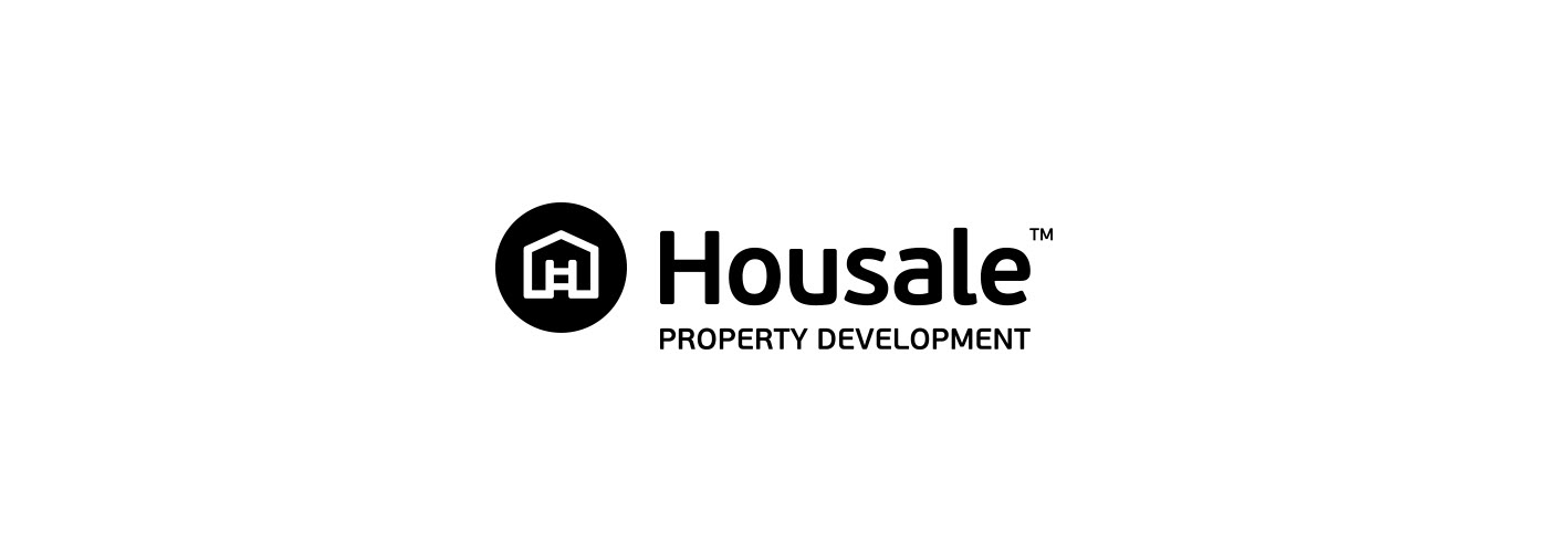
Housale Property Development
Τhe name of the company, comprises of the words “House” and “Sale”, a combination which aptly points to its business object. The logo depicts the stylized design of a house inside a circle, thereby pointing to the concepts of organization and diligence, which are fundamental in any building project.
The ladder inside the house, also symbolizes construction, hence making a reference to the company’s services, which include property research and acquisition, development and sale. As for the color choices, yellow symbolizes light, it is positive and energizing. Moreover, as it is typically used to denote “works in progress”, it creates a reference to one of the company’s main fields of operation (construction). On the other hand, grey is used to signify professionalism, thus enhancing the validity and status of the company.
© 2009

220 Electrical Installations
The source of inspiration was the company’s business object itself –namely electrical installations: In particular the number “220” which constitutes the current’s measurement unit in Greece was selected as both the name of the company as well as its logo’s design main theme. The name and theme of “220” aptly points to the company’s business object. The fact that “220” is written in one stroke, aims to suggest that the company provides integrated services and solutions. The choice of red is intentional in that it is eye catching and attracts attention. All in all, this logo is bold and memorable while managing to wittily and succinctly convey what the company is about.
© 2009
© 2009

Mamakita Just for Kids
The name is derived from the combination of the Greek words “mama” (mother) and “kita” (look). “Mama kita” is one of the most common phrases that children use in order to direct their mother’s attention to something that caught their eye or something they did. The accompanying design depicts a paper boat, thus on the one hand creating a reference to the classic makeshift construction and on the other, to the journey towards adulthood. The “royal” mauve was selected in order to signify the notions of creativity and nostalgia, while orange as the color of energy reflects enthusiasm, happiness, warmth and playfulness.
© 2009
© 2009