
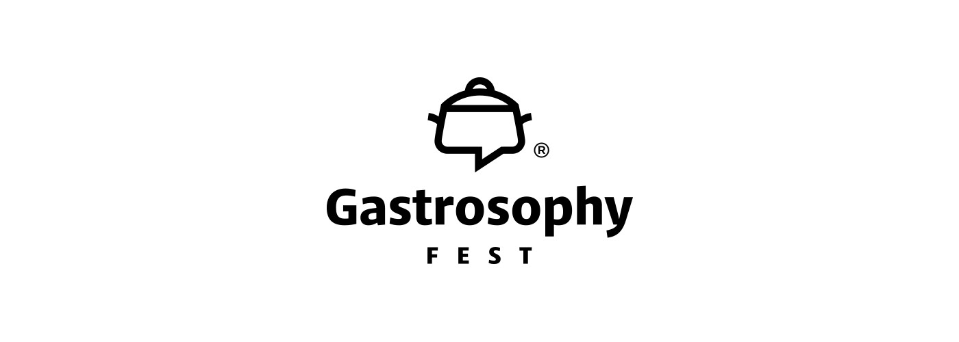
Gastrosophy Fest
The design of the Gastrosophy® Fest logo was inspired by the form of ancient clay cooking pots.
The “speech bubble” symbol has been integrated into the geometric shape of the cooking pot, serving as a visual reference to communication, exchange, and community, all key characteristics of the gastronomy festival.
Thus, the symbol is not limited to the concept of food and cooking, but extends to encompass the idea of shared encounters and narratives around it.
The color palette features warm, earthy tones, drawing inspiration from the textures and colors of ancient pottery and natural materials, such as clay and wood.
© 2026

Houlaki Studio
Designed for photographer Aphroditi Houlaki, this logo symbol is an abstract representation of a retro camera, fusing the analog with the digital, the old film with geometric shapes referencing pixels.
Thus, the symbol evokes the connection between tradition and modern technology, highlighting the timelessness of photographic art.
For the corporate identity, candy pink was chosen as the reference color. It is a shade that exudes sensitivity, warmth, and discreet femininity, while being instantly memorable and recognisable.
This pink, combined with black printing, balances emotion and professionalism, creating a contemporary, refined aesthetic, which reflects the philosophy of the photographer.
The font selected is a geometric sans-serif, which is characterized by clean lines, simplicity, high legibility, and timelessness.
© 2026
© 2026

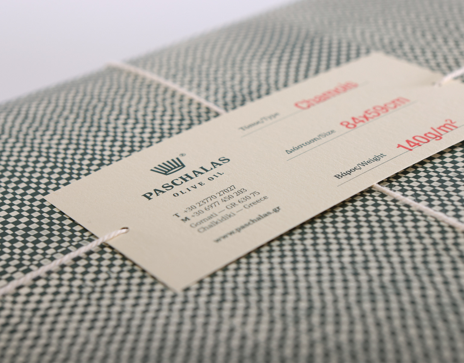
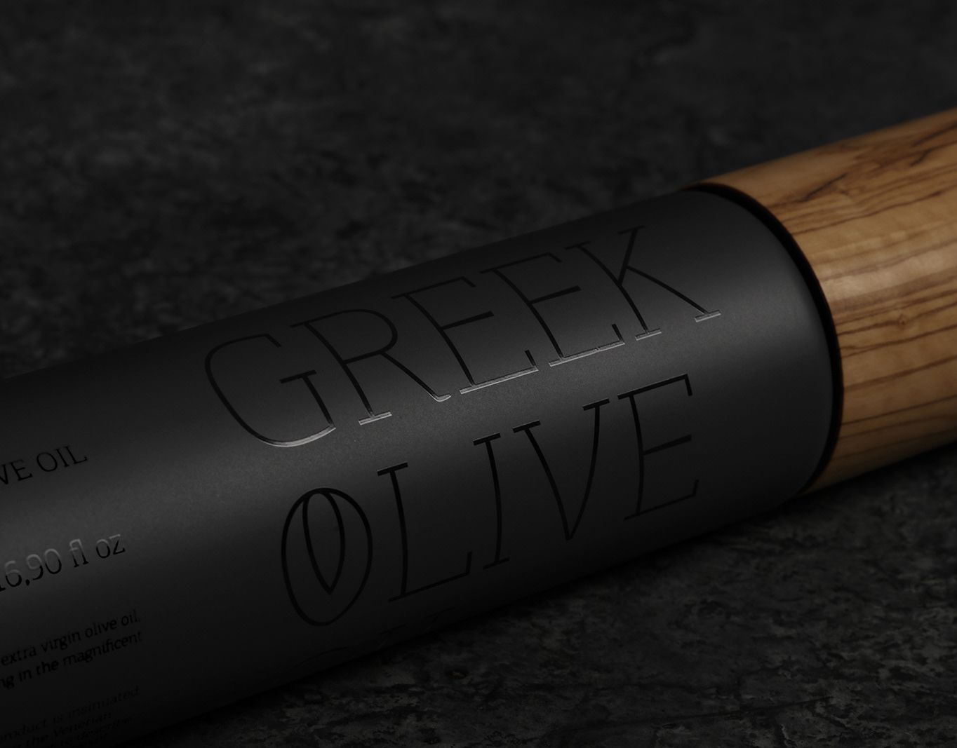
Paschalas Olive Mill
Paschalas Olive Mill is an oil extraction plant in the area of Gomati, in Chalkidiki, Greece.
The company logo is a typographic depiction of the geometric shape of a millstone, a circular pair of stones which, in the olden days, was the main device used for smashing and grinding the olive fruit in order to produce olive paste, the first stage of oil extraction.
Located in the same premises as the oil mill, the Olive Shop of Paschalas Olive Oil offers a variety of products made entirely from extra virgin olive oil.
The typefaces selected are characterized by clean lines, high legibility, and a timeless quality.
The colors clearly indicate the company's scope of work, the oil production process.
© 2025
© 2025
Moniatis Winery
The brand name of "Moniatis" winery, comes from the word describing the villagers of Moni, in Naxos island, where the owner family hails from.
The logo symbol is a linear visualization of two vineyard stakes, which are facing each other in order to create an M, the first letter of the company brand name.
The oval shape represents the grape.
© 2025
Spiropoulou & Associates IT Law
"Spiropoulou & Associates" is a law firm in Athens, Greece, specializing in cases of New Technologies, Personal Data Protection, and Intellectual Property, since 2002.
The symbol selected for the logo was the sword. It symbolizes force, protection, and justice.
Its design, however has a double interpretation, since the symbol was designed in such a way that it references the Latin characters I and T (IT- Information Technology).
For the typographic characters, we opted for a multidimensional geometric font, with special features which spark interest.
In order to better serve the visual identity of the law firm, the custom-designed acronym (T) of the logo symbol was incorporated as an alternative character in the font.
The capital letters, as well as the color palette used, add prestige and credibility to the visual identity.
© 2024
GENEDIS Genomics Neuroscience & Data Innovation
GENEDIS, (Genomics, Neuroscience, Therapeutics & Data Innovation Summit), is a Global Multidisciplinary Scientific Conference taking place every two years. This year's theme of the conference is “Computational neuroscience and integrative medicine: A holistic approach to health and well-being”.
Over 50 keynote speakers from leading institutions such as Johns Hopkins University, the Karolinska Institute of Neurophysiology, the National Institute on Aging (NIA/NIH), EMBL Heidelberg, and Columbia University are participating in the scientific program, and will be sharing their work and discuss the latest findings in the field of neuroscience.
This year's conference will take place at the Stavros Niarchos Foundation Cultural Center.
The logo symbol is an abstract visualization of the cerebral hemispheres, which are deconstructed into the geometric form of a labyrinth, indicating both the theme, and the purpose of the conference, which is none other than to communicate and discuss the research and conclusions emerging via the labyrinthine, complex processes of scientific study and research.
The colour palette is inspired by the hues of the brain cortex, skin and neurons.
The symbol is perfectly symmetrical and exudes a timelessly Greek spirit, from its connection with the Minoan labyrinth.
© 2024

Kormaris Kitchen Hub
"Kormaris Kitchen Hub" is a furniture design and manufacturing company, focusing on providing comprehensive solutions for home kitchens. The logo symbol is a visualization of the basic elements of a kitchen space (furniture and appliances).
The symbol deconstructs the image of a kitchen into abstractive geometrical forms - so that it can effectively depict the range of works and services that the company offers, from design and furniture manufacture, to the selection of electric appliances, as well as the fitting of the kitchen, delivering a new and complete finished space.
© 2023

Ateno Cook & Deli
Located in the historic Athens downtown, Ateno® is a gastronomic destination, which combines a delicatessen offering a selection of the finest Greek food products, with fine cuisine based on these high quality ingredients.
The logo symbol was inspired by the columns of the Gate of Athena Archegetis, which lead into the Roman Agora of Athens, the epicenter of commercial and political life of the Roman Era, a central marketplace and meeting point of those times - the ruins of which are still standing in Monastiraki Square today.
The logo symbol that was designed adheres to the classical architectural order, with the diameter of the column shaft gradually narrowing towards the top, while the column grooves end up taking the shape of the tines of a fork, in a clear visual representation of a food establishment.
© 2023
The logo symbol that was designed adheres to the classical architectural order, with the diameter of the column shaft gradually narrowing towards the top, while the column grooves end up taking the shape of the tines of a fork, in a clear visual representation of a food establishment.
© 2023
Causebook
Causebook advances a legacy in the publishing industry that dates back to 1933, focusing on environmentally sustainable practices while crafting luxury, high-quality notebooks.
The logo symbol we designed takes inspiration from the letters C and B of the words Cause and Book of the company brand name, which become a visual representation of the top view of a notebook.
© 2023
Gatto Nero Cuisine
Located in the area of Spilia in Corfu since the late 19th century, "The Black Cat" is probably the oldest cafe-restaurant in the island. It was first established by the brothers Chanou on the ground floor of a historic stone four-story mansion. According to the local legends, its name is attributed to a single black cat that stepped over the foundations of the building during its construction.
Located in the area of Spilia in Corfu since the late 19th century, "The Black Cat" is probably the oldest cafe-restaurant in the island. It was first established by the brothers Chanou on the ground floor of a historic stone four-story mansion. According to the local legends, its name is attributed to a single black cat that stepped over the foundations of the building during its construction.
For the redesign of the restaurant's logo, we selected a fork as the symbol, but the logo design offers a dual meaning. The two forks are a clear symbolism of the food sector, while their placement, symmetrically mirroring one another, is a visual representation of a cat's mustache.
© 2023
© 2023

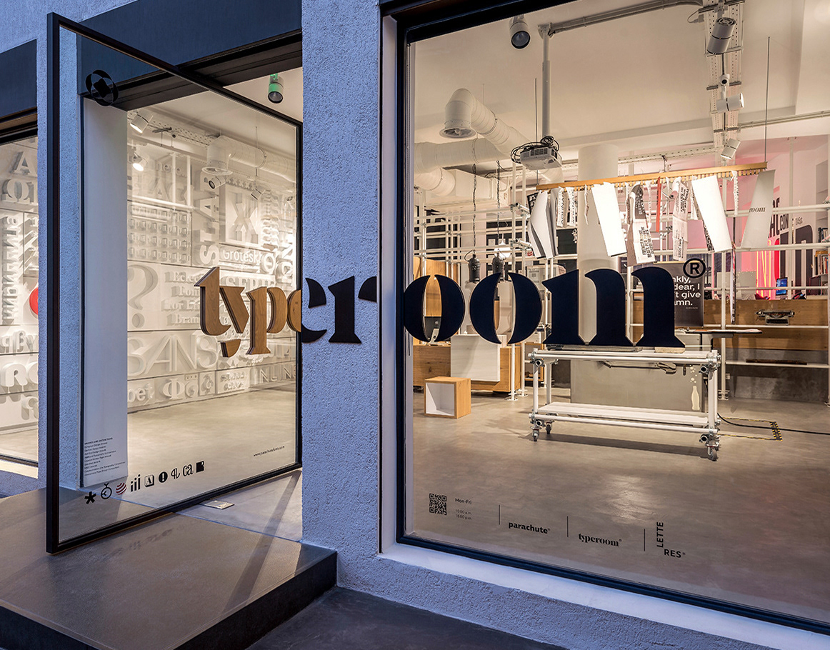
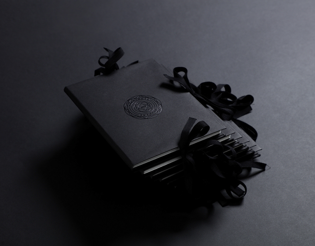
Letteres Living Type
Parachute typefoundry is a design company specializing in visual communications and typography, as well as the creation of original functional objects which are intrinsically linked to typographic elements. As production of these one-of-a-kind design objects expanded, a new brand was warranted to house this venture. Its brand name, Letteres.
A portmanteau of the English word Letter and Res, the Latin word for object, Letteres is a clear, succinct definition of what this company is all about.
For the company logo, a heart, symbolizing the love and passion for typography, was designed in geometric lines. As the symbol rotates at a 45-degree angle, it creates a capital L, the company initial.
For the typography, the selection of a monospaced font and capital characters signifies the prestige and dependability of the company.
© 2023

Kyr Antonis
© 2022
© 2022
Kouroupis Konstantinos Endodontist
Endodontic treatment is the removal of the contents of the pulp cavity, cleaning it and forming the root canal in a suitable shape so that to follow hermetic obturation with some biologically compatible material.
The logo symbol, the dots, visualize the root canal orifices required for endodontic treatment.
At the same time the distance between them outlines the frame of the capital letter (K) of the brand name.
In the current application of the logo, the orifices have been depicted by perforating the paper in each application of the corporate identity, realistically visualizing the occupation, endodontics.
© 2022

Toula's Seaside
Toula’s Seaside, based in Corfu, has been active in the sector of gastronomy for 40 consecutive years.
The symbol of the logo tells the story of this unique restaurant through three characteristic objects: on one hand the millstone connects the business with the past, as it is housed in the the old family mill that dates from 1892, while, the professional stove promotes the cuisine and consequently the gastronomy, and the steering wheel of the ship the knowledge, the experience as well as the unique journey in taste that the restaurant offers.
© 2021

Kamares Multivenue
'Kamares Multivenue' is based in the green meadow of Kythera. Inspiration for the symbol of this unique multi-space was the historic stone bridge of Cantouni, built by the English in 1826.
The deconstruction and recompositing of the architectural elements of the bridge led to the creation of the geometric shape of a crown, visualizing the excellent quality of all raw materials, as well as the services provided by the business.
© 2021

Lavranos Delimeat
The Lavranos Delimeat is a high-quality meat and deli products’ business. A rooster was selected for the symbol of the logo, to visualize the positive and optimistic start of the day and, in addition, to suggest the pride that comes from the quality of the products and services provided by the company.
© 2021

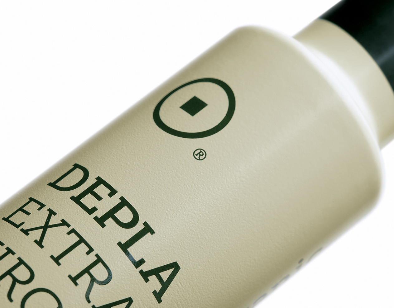
Paschalas Olive Oil
The Paschalas Olive Oil company specialises in the cultivation of olive trees and the creation of products related to olives. Inspiration for the symbol of the company logo was “the comb”, a tool used in the harvesting of the olives, indicating the personal care that exists from the first moment of this olive oil’s production.
This symbol, however, has a double meaning semantically, as it resembles a crown. It thus symbolizes the exceptional quality of the olive oil, as a result of the entire production process, from picking to consumption. The gold color of the logo refers to the color of the olive oil.
© 2021

Louter Essentials
The company Louter Essentials is active in the fashion industry and specifically in bathroom items. Its name is inspired by the ancient baths which, in addition to being a place for personal care, were also a focal center for meetings and communication. Music and the liquid element refer to the human senses. Music, which in Ancient Greece had a leading role in education, denotes peacefulness and relaxation and is symbolized by the lyre.
The liquid element is symbolized by the fountain, the reference point of the company’s products, while at the same time it expresses the social aspect of the baths and also the timelessness and classic value which constitute part of its philosophy. The designing of the logo symbol was based on the character of the printing types. The chosen colors are soft and exude elegance.
© 2020

Redens Dentalab
Dental technology is the focus of this Dental Laboratory’s work. The name was created by the Latin word "dens" than means “tooth” and the prefix "re" indicating reconstruction. The logo is based on the typographic characters of the name ''Redens'' and the descriptive subtitle ''Dentalab''. The characters of the two words follow two paths: the title follows the upper jaw and the descriptive subtitle the lower, thus inventively visualizing the oral cavity, with the grammatical characters playing the role of teeth.
The logo is symmetric, geometric and centrifugal. Τhe different typographic weights separate the title from the subtitle so they are both immediately recognizable. The logo indicates that the laboratory undertakes the design and manufacture of all kinds of dental prosthetics of the oral cavity. The target audience of the dental laboratory is dentists, so the color palette chosen is mild and directly related to the medical field.
© 2020
© 2020

Terrago Construction
Terrago is a construction company. The name "Terrago" derives from the Latin words Terra/Earth and Ago/Build. The symbol of the logo is based on geometry and depicts the initial letter of the company’s name which, with the development of its right acronym, suggests a roof and an excavator.
Terrago is a construction company. The name "Terrago" derives from the Latin words Terra/Earth and Ago/Build. The symbol of the logo is based on geometry and depicts the initial letter of the company’s name which, with the development of its right acronym, suggests a roof and an excavator.
The solid typography chosen refers to heavy constructions, while the dynamic combination of the selected colors (dark gray and yellow), indicates attention and danger.
© 2020
© 2020

Dope Roasting Co.
Dope® Roasting is a company specialising in the production, serving and distribution of fresh coffee. Semantically, the logo symbol can be interpreted both as a cup of coffee with the geometric form of a raw coffee bean and with the register mark suggesting a handle and as a coffee roasting grinder where the granules are cooled, as seen from above.
In a 90-degree rotation the symbol forms a 'D', the first letter of the company, while the width of the fonts chosen equals that of the symbol. Lastly, the corporate colours are inspired by the shades of the different coffee roasts.
© 2019
In a 90-degree rotation the symbol forms a 'D', the first letter of the company, while the width of the fonts chosen equals that of the symbol. Lastly, the corporate colours are inspired by the shades of the different coffee roasts.
© 2019

Paraty Nature
Paraty® Nature creates lingerie and underwear made of natural, soft and breathable fabrics, especially designed for sensitive skin and women who have had cosmetic -or other- surgery.
The logo symbol is inspired by the Letterhead “P” of the company name, which is used twice, with the two letters facing each other, symbolizing its two owners. This dual P is then rotated by 180 degrees in order to visually create the shape of a bra, main product of the company. The colour palette is mild and earthy, based mainly on pastel shades.
© 2019
© 2019

Kallistefi Olive Gems
The company specializes in the trade of olive oil and olive products. The name is inspired by ancient history and, particularly, by the wild olive tree, which the ancient Greeks called "kallistefanos", from the branches of which the honorary wreath "kotinos" was made, in order to crown the winners of the Olympic Games.
The company specializes in the trade of olive oil and olive products. The name is inspired by ancient history and, particularly, by the wild olive tree, which the ancient Greeks called "kallistefanos", from the branches of which the honorary wreath "kotinos" was made, in order to crown the winners of the Olympic Games.
The logo visualizes the geometric shape of a wreath containing the branch and fruit of an olive tree.
© 2019
© 2019

iDentical Premium Care
The symbol of the logo was inspired by the oral cavity, since the clinic specializes in therapies that provide complete oral rehabilitation with dental implants, dental crowns, dental bridges and more. The logo symbol is geometric, symmetrical and harmonious.
The inner geometric shapes visualize the upper and lower jaw bones, while the outer shape visualizes the lips. In addition, the closed outer shape semantically refers to the integrated care offered by iDentical. The colors of the logo are pastel blue and pink, inspired by the colour of the gums.
© 2019

Hoocut True Pitta
The naming was created from the combination of the word "hook" and, in this case, the hook from which the meat is cut, and the word "cut". The descriptor “True Pitta” highlights the actual product, which is the Greek pita wrap. The symbol of the logo visualizes the pita wrap in a geometric form. The typography chosen is Stencil, with a clear reference to cutting.
© 2018

Sway Bar & Kitchen
© 2018
© 2018