

Filmcenter Greek Film Center
This logo is directly associated with the cinema, as it depicts the first thing that the viewer sees when he enters the movie theatre: the rows of seats in front of the projection screen. This is a familiar image, which is understood by young and old, alike.
The style is intentionally minimalistic and austere, so as to project the values of status and quality, which lie at the heart of Film Center’s philosophy. The contrast of black and white is dynamic and draws attention. At the same time it lends a charmingly retro tone to the logo design, by creating allusions to black and white cinema.
© 2008
© 2008

Vrionis Music House
The logo depicts the outline of a classic piano. The particular instrument was chosen for it constitutes the flagship of any orchestra. Its minimalist, austere shape reflects its value as an instrumentwhile simultaneously, by forming the letter B (the Greek equivalentof the latin letter “V”), it depicts the initial of the company’s name (which in Greek is spelled Βρυώνης»). The design is simple and concise so as to project trustworthiness, and at the same time unique so as to suggest originality and prestige. It draws attention; it is memorable,diachronic and aesthetically flawless. The sturdy Serif fonts symbolize the company’s gravity, while the color violet combines passion and wit and embodies charm.
© 2008
© 2008

Mindart Photography
The logo has a dual symbolism. On the one hand, it points to the thought process, which is intrinsically connected to the first component of the company’s name (Mind) and, on the other hand, photography itself. The design was inspired by the camera lenses and the Auto Focus function of a camera. In effect, it constitutes their abstractive, schematic depiction. Red is a vibrant, expressive, happy color which inspires warmth and vitality. Due to itsappealing qualities, red becomes dominant and aggressive. Red was furthermore selected as it is the color which is associated with the old fashioned printing booth.
© 2008
© 2008

Mykonos View Hotel
The source of inspiration is the very image that the visitors see when they open their windows: A postcard perfect Mykonos View-as the Hotel’s name also indicates.The image is formed by a combination of the outlines of traditional Myconian houses as well as various elements that are typically associated with the island: A small church, a chimney, a windmill and the traditional arches ("camares"). The synthesis is included within a frame with curbed corners, similar to these of the traditional Myconian "camares". Light blue is a soft, gentle color which symbolizes tranquility and wholeness. It is clear; it alludes to the color of the sea and the sky and bestows serenity. Its combination with grey encapsulates the hotel's modern character.
© 2008
© 2008

Oniro The Bar
© 2008
© 2008

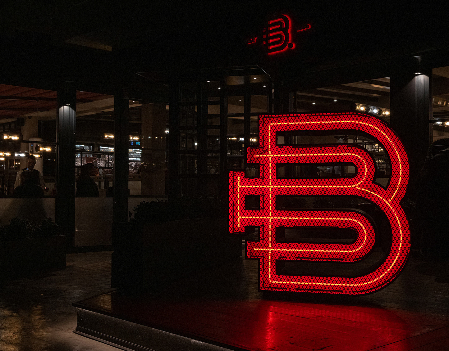
Dressing Bar

Elements Lines & Senses

Semeli the hotel

CPA Corfu Property Agency

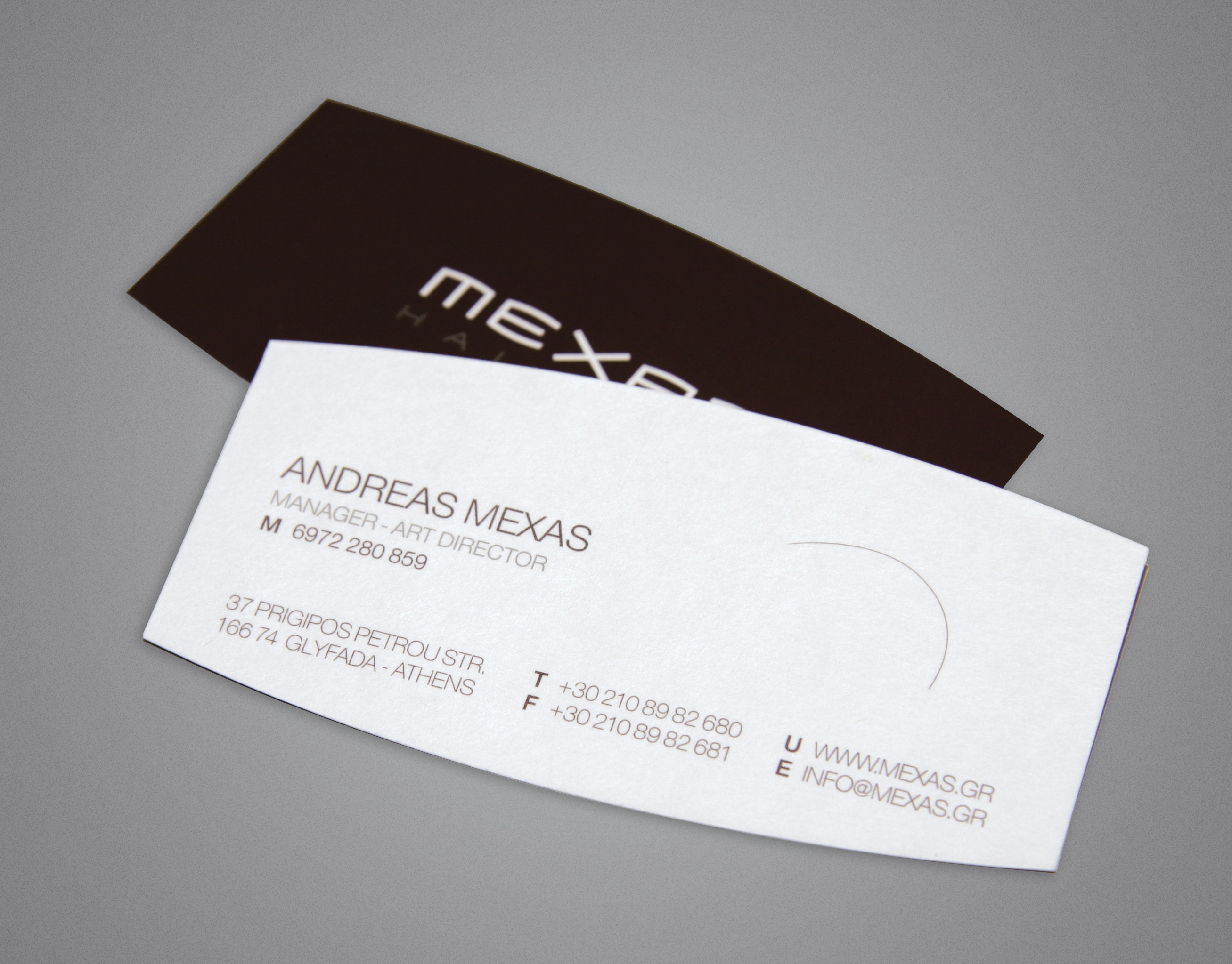
Mexas Hairwise

Omnis Managed ICT

The Corfu English School

Mn Style Hairdresser

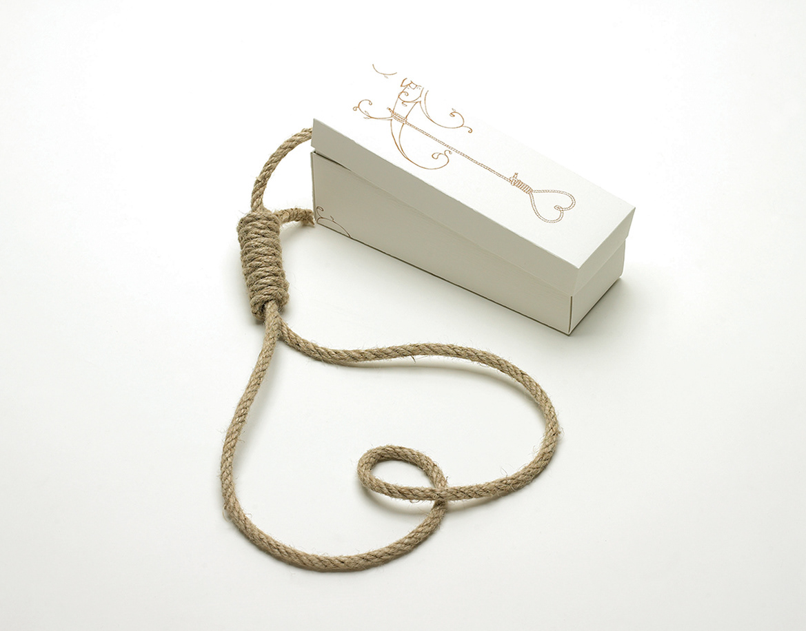
Romeo & Juliet Night Club
Romeo & Juliet is a night-club in Greece. Our target group for this project was local people, plus the majority of Italian tourists that visit the Island during the summer months. The three values that mainly represent the club are passion, uniqueness and responsibility. We visually expressed those values by creating three combined hearts, one within the other. The element of fun, carelessness and partying had to be obvious, therefore all three hearts have an ‘arlekin-joker’ hat on top. ‘Arlekin-joker’ first made their appearance in the 15th century; They represent someone cunning, smart, someone that knows how to have fun, the soul of the party! The ‘arlekin-joker’ hat symbolizes that this club is a place where one can dance, drink, flirt and be the centre of attention.
© 2007
© 2007

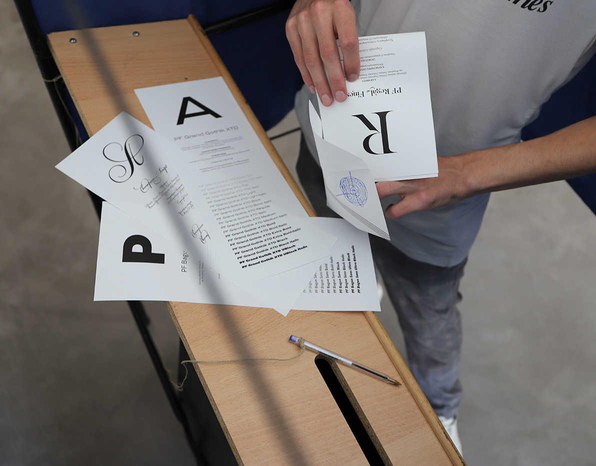
Crayon Creative & Print Solutions

Il Gatto Caffe

Semeli the bar

Liston

Inside Cafe - bar

Bespoke Athens

EY Lounge Cafe

Gravity The Music U Breathe