

Skaras® Jewels
The Skaras® Jewels family business has been in the jewelry and watches trade for over 65 years. Source of inspiration for the design of the logo symbol was the first letter of the brand in combination with the shape of the diamond. In the geometric form, the large diamonds visualize the object of the business, whereas the small diamonds visualize the concept of time, by forming an hourglass.
© 2017
© 2017

Korakianitis® Bakery
Korakianitis is a family bakery business based in Corfu, operating for more than 35 years. For the symbol of logo a monogram was studied and designed. It consists of the first letter of the family business, which transforms into wheat -the raw material from which bread is made.
© 2016
© 2016

Dezone® Archi+
Logo redesign on behalf of the architectural office Dezone®, which designs, supervises and constructs commercial buildings, hotels and private homes. The monogram of the logo is the result of a printing composition (D & Z) with clear reference to architectural blueprints.
© 2016
Logo redesign on behalf of the architectural office Dezone®, which designs, supervises and constructs commercial buildings, hotels and private homes. The monogram of the logo is the result of a printing composition (D & Z) with clear reference to architectural blueprints.
© 2016

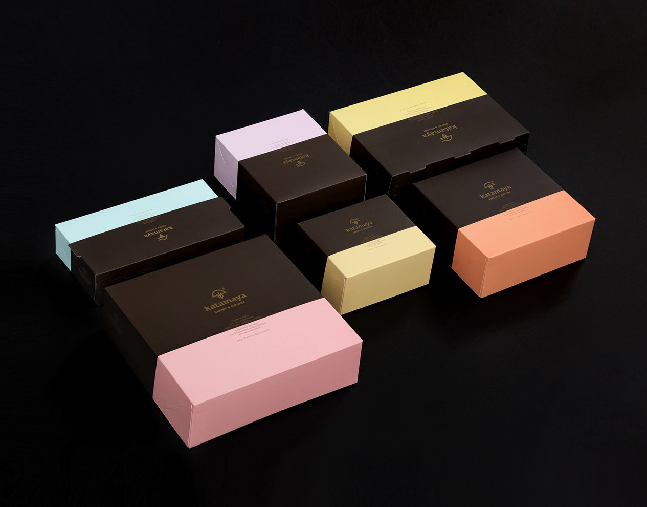
Katamaya® Bakery
Logo for the company Katamaya® | Bakery, which specializes in bakery and confectionery. Its name was created by the words "katamageion" (a tool used in the past for cleaning the oven) and the Greek word for yeast (mageia). Inspiration for the logo symbol was the geometric form of the old wood-fired oven, as well as the wheat, the key raw material of handmade bakery products.
© 2016
© 2016

Kuero® Concierge
The source of inspiration for the name Kuero® is the location with the same name, where the lighthouse of Lakka was constructed on Paxos, the island on which the headquarters of the Concierge Company is located. What was chosen as the main symbol for the designed logo, is a lighthouse that its semiotics guide the traveler towards the right direction. Through the representation of a beam of light that is formulated by the shape of a bow-tie, the aim is the depiction of top-notch services that are offered by the company.
© 2016
© 2016

Papadellis® Olive Oil
Papadellis is a family business that specializes in the production and processing of olive oil in Mytilene, since 1980.Symbol of the logo is the flower of the olive tree, which in a single stroke forms a “sfirida” (a special filter consisting of a round and flat mesh of coarse fibers used in the olive oil press), in order to visualize the integrated services that the business offers, from the harvest up to the production process. The chosen typography is uppercase in order to convey credibility and validity.
© 2016
© 2016

Kuziniera® Pasta Corfiana
Kuziniera is a company that manufactures fresh handmade pasta. The name was inspired by the Italian word ‘cuciniere’, which means ‘cook’, referring to the 'cooking' by the company's owners, of the recipes used in the production of the pasta. The symbol of the logo was inspired by the variety of the produced pasta. Two different kinds of pasta were used for the design of the symbol, one inside the other, in order to visualize a rolling pin, a symbol linked to tradition and handcrafted manufacturing.
© 2016
© 2016

Mikronisi® Beach Venue
© 2016
© 2016

Basegrill® Athens
The logo symbol is based on the initial letter of the business and its design is inspired by the classic heating element of an electric oven. The weight of the typography has been chosen in order to create a symbolical link to the basic product of the company, the meat.
© 2015
© 2015

Lacovino® Winery
The name Lacovino refers both to the land of Laconia and the wine, describing the origin and activity of the company. Symbol of the logo is the circle, which visualizes the barrel used for the fermentation and storage of the wine. This circle contains the shape of a glass, the rim of which resembles the castles found in Laconia. This way, the entire production process is identified, from the fermentation to the pleasure of tasting the wine.
© 2015

Travolta® Fish Tavern
Source of inspiration for the symbol was the lantern, which is used by fishing boats to attract fish (called “pyrofani”). The design of the symbol was based on the pyrofani, combined with the geometric shape of a fish. The chosen typography is lowercase∙ its letters’ width equals that of the symbol, in order to convey consistency and friendliness. The color palette refers to the element of water, the sea.
© 2015

Kinglike® Travel & Concierge
Inspiration for the naming was the high quality of personalized travel and concierge services of the business. The symbol of the logo visualizes the Greek paper boat, symbolizing the transition, through the journey, to a destination. Secondarily, it displays the image of a crown, thus highlighting the values of Kinglike and its emphasis on quality service. The geometric and symmetrical character of the symbol offers the logo prestige and reliability and enhances its timeless value, while the choice of lowercase typography conveys friendliness and attention to individual needs.
© 2014
© 2014

Esterra® Olive Goods
Esterra is a family Company that deals with the cultivation, commerce and export of olive oil, as well as other quality products based on the olive. Our enterprise has as goal to develop and expand its activities to other agricultural products, cultivated in the fertile land of Messinia. The name of the Company comes from the union of the archaic “es” (from) with “terra” (land, in latin) and its goal is to express the connection of the Company to the traditional cultivation and the purity of the products of this land. The design of the symbol of its trademark also stems from the values that mark this Company. Thus, knowledge and tradition lead to the design of an eternal unique olive tree, which has a ladder as a trunk, an element that symbolizes at the same time the traditional way of collecting olives as well as the modern, dynamic prospects of the Company.
© 2014

Cookoovaya® Wise Cuisine
The name was chosen based primarily on the identification of the owl with knowledge and wisdom, aiming to show the deep knowledge of its chefs and their gastronomic "wisdom". On a second level, the name connects the owl –whose vision is excellent both during the day and the night- with eating out in a restaurant, something that can be done noon or evening. The symbol of the logo was inspired by the eyes of an owl, designed in a way resembling the cooking hotplates of a professional kitchen. For the logo, the chosen typography has clean, simple lines and capital letters that equal the thickness of the logo symbol, in order to express the restaurant’s validity and professionalism.
© 2014
© 2014

Mealout® Dining Card
© 2014